
The Secret Of The Swoosh
Legend has it the Nike Swoosh was designed by Carolyn Davidson for a whopping $35. That’s 1971 money mind you, so founder Phil Knight would have to cough up about $200 for the world-renowned logo today.
Not bad, Phil.
To be fair, Carolyn was later given jewelry and Nike stock, but regardless of compensation, why has the iconic swoosh stood the test of time?
Truly great logos all adhere to three basic rules. If yours doesn’t, it’s a pretty good bet you need to give us a call (hint, hint Sherwin-Williams).
RULE 1: It Should Make Its Mark
Sounds like circular logic, doesn’t it? The subject matter of the logo need not be the subject matter of the business itself. Starbucks isn’t a pile of coffee beans. Apple shows no computer. Mercedes isn’t a car.
To quote the oldest and perhaps best known of the holy trinity of logo designers (Paul Rand, Saul Bass, Milton Glaser),
“Surprising to many, the subject matter of a logo is of relatively little importance, and even appropriateness of content does not always play a significant role.” – Paul Rand
Does that mean a great mark with great symbolism can’t be achieved? Look no further than these examples.

Office Angels RBMM

FedEx Lindon Leader

Fishing Texas Lakes Justin McGuffin
RULE 2: If it Doesn’t Work Small, It Doesn’t Work
A business card is 3.5 inches wide. That’s it. And the screen on your mobile phone crams 15 or so little “logos†into the same-sized space. Many a logo design looks great in our sketchbooks but doesn’t make the final cut due to this rule alone.
Simplify, simplify, simplify.
McDonald’s gets it done with a M. That illustration of Newton holding an apple contemplating the equation for gravity just isn’t going to fit.

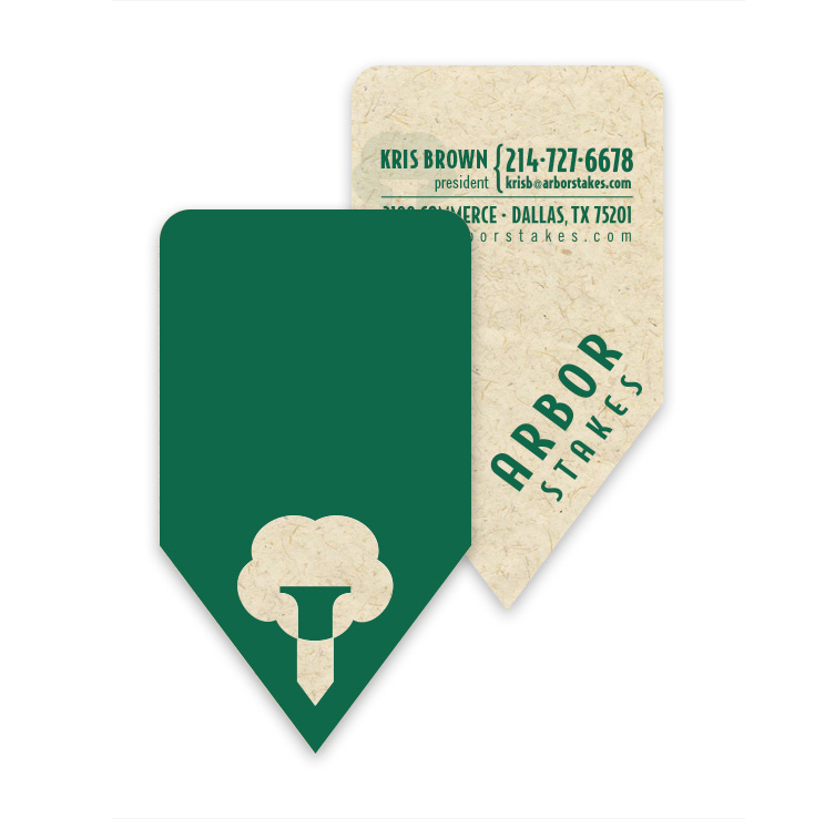
Arbor Stakes Trademark Michael Aars

Arbor Stakes Business Card Michael Aars
RULE 3: Always Bet On Black
Sooner or later all the fancy shines and drop shadows have to step aside and your logo must stand naked (and still work) in black and white. Our favorite of the rules, we call this the “etched on a beer glass†test (thanks to our fine friends at Andrews Distributing).
Often overlooked for convenience, (cough, cough NBA) international design firm Pentagram proves our point by having the guts to present their logos knowing this piper always gets paid.

Tidal Wave Trademark Mike Beitler
*MODERN RULE 4: The Rule of Squares
With the above three rules met, your logo will live a long and happy life. But we would be remiss if we didn’t mention social media. Heard of it?
On day three of your logo’s life it will be crammed onto a profile page at Facebook, Twitter, Google+, Pinterest, or any number of other sites. All of which, quite literally, put your creativity in a box. A very small box.
Unless this whole internet thing folds, it would be wise to consider the Zuckerberg-effect before sending 250,000 business cards to press.
And if you need a quarter of a million cards…469-251-2656, 24 hours a day, 7 days a week. Plus, everyone at Tidal Wave will get your logo tattooed.